Are your customers abandoning your checkout page? Don’t be concerned. All you have to do now is optimize your checkout page.
It is critical to make the checkout process as effective and efficient as possible to ensure that the user takes the purchase with them. Increase conversions and turn your visitors into potential customers. Increase the number of visitors to your website. Always keep in mind that the success of your e-commerce website is determined by how many sales you make, not by how many people you happen to attract to your website.
We will assist you in ensuring that your visitors do not abandon their carts and continue to shop on your website. Let’s take a look at some ways to optimize your checkout page, but first, let’s take a look at what the entire checkout process looks like.
What does the checkout process look like?
When a potential customer arrives at the payment page, it is discovered that they have already decided to buy or purchase. There is a lengthy process and journey involved, beginning with user awareness and progressing to interest, desire, and final purchase. If any of its steps fails, it means that the sale is lost.
In general, a typical checkout process looks like this:
1. Product page
2. Shopping cart page
3. Reviewing items
4. Billing as well as shipping information
5. Payment information
6. Order confirmation
Reasons For Cart Abandonment
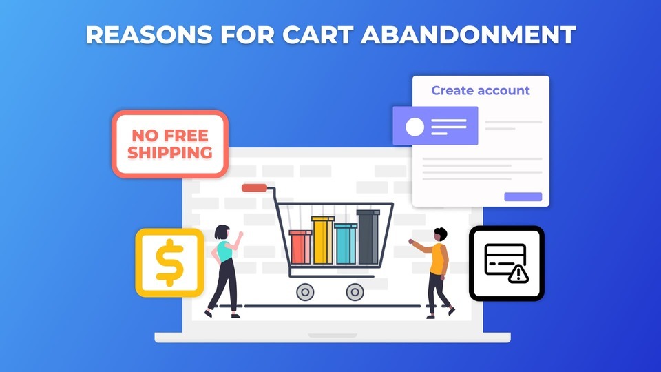
It is critical to understand what causes customers to abandon their respective shopping carts.
- Price: Most customers abandon their shopping carts because the price is higher than they expected.
- Create account: In most cases, customers are required to create an account before purchasing any item or product.
- No free shipping: Many customers do not purchase because they do not qualify for free shipping due to their small order size.
- Payment issues: Customers abandon their carts for a variety of reasons, one of which is a lack of payment methods.
10 Fascinating Ways to Optimize Your Checkout Page
Here are the 10 effective methods for optimizing your e-commerce checkout page and increasing conversions.
1. Avoid mandatory sign-ups
2. Provide customers with extra benefits at checkout
3. Display trust signals
4. Multiple payment options
5. Save Your Customers’ Details
6. Use mobile-friendly design
7. Perform A/B testing
8. Use Live Chat
9. Offer Free Shipping or at least cut down the shipping cost
10. Use exit popup
1. Avoid mandatory sign-ups
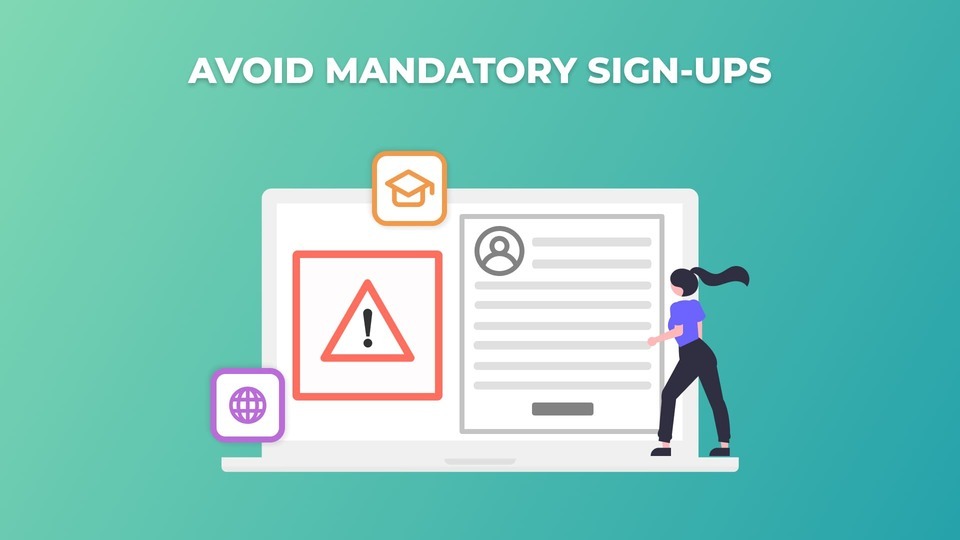
Registration is a big source of resistance on your websites.
According to one study, as many as 37% of customers or users abandon their carts simply because they had to create an account to shop.
You would never want to lose such valuable customers. Right?
To optimize your checkout page, you must avoid any type of mandatory sign-ups and provide a guest checkout option on your eCommerce website. After checking out, you can also give the customer the option of creating an account.
2. Provide customers with extra benefits at checkout
During the checkout process, you can offer your customers a variety of extra add-on benefits. For example, if you look at Amazon Prime, you’ll notice that it provides fast and free shipping to those who are paid members or have subscribed to it.
As a result, it has been discovered that the best way to optimize your checkout process is for e-commerce websites to offer free shipping offers rather than just discounts.
3. Display trust signals
When it comes to when customers pay for an online purchase, payment information security is critical.
People frequently question the authenticity of a website’s security level, especially if they are first-time visitors.
Trust seals, badges, SSL badges and certificates, return policies, guarantees, testimonials, client lists, and other similar features provide customers with increased trust and security when making any type of online purchase.
After you’ve implemented all of these trust signals on your e-commerce websites, you’ll be able to easily increase your conversion rates.
The words chosen should be chosen with care. For example, “fast and secure checkout” is preferable to simply “checkout.”
Furthermore, when it comes to online shopping, PayPal is the badge that shoppers trust the most.
4. Multiple payment options
According to a study, roughly 10% of people have payment problems.
By providing multiple payment options, you can bring convenience to your customers and make their lives easier.
To optimize your checkout process, we discovered that customers are more likely to complete their purchase if their payment method is safe and secure. Similarly, providing flexibility with payment options can increase your conversion rates. By providing payment after delivery, digit wallet, e-wallets, bank transfers, cash on delivery (COD), and other options.
5. Save Your Customers’ Details
Storing your customers’ credit card information so they can make purchases without entering their information each time will make the next purchase less painful and burdensome for them. You can even track customer data and browsing behavior with smart advertising to identify non-purchasing visitors.
This allows you to target specific customers. Customers can also be targeted through email marketing campaigns.
6. Use mobile friendly design
Do you know that the number of mobile device sales increased by 65 percent between 2015 and 2016?
The question is, what can be done to improve the mobile shopping experience? You can increase revenue at the checkout by providing customers with a variety of payment options. Reduce the number of ads, graphic elements, and plugins to improve load times.
PayPal can help you speed up the checkout process by auto-filling address and payment information, which is often a hassle on mobile.
Make your checkout page even more mobile-friendly by ensuring that your mobile checkout works, enabling guest checkout, enabling auto-fill, and so on.
7. Perform A/B Testing
- Attract and enthrall your intended audience.
- Optimize in an extremely strategic manner.
One method for optimizing your checkout page is to use A/B testing. It is in this section that you will create two versions of a page. The first is your current setup, and the second is your modified page.
Optimize your website by running both of these pages concurrently and observing which one generates the most sales.
Furthermore, we can see that the efficacy of A/B testing in checkout page optimization was demonstrated in a study conducted by Elastic Path. The company conducted A/B testing to determine whether a single-page checkout or a multi-page checkout process would be more effective.
According to the findings, single-page checkouts convert 21.8 percent more customers than multi-page checkouts.
8. Use Live Chat
- Providing customers with the option of live chat is a critical feature.
- It’s the most convenient way for users to get in touch with you.
When a customer has a question or encounters a problem on the checkout page, having immediate access to customer support will help you build trust and close the sale.
9. Offer Free Shipping or at least cut-down the shipping cost
Free shipping, or at least a reduction in shipping costs, is an absolute must. Another eCommerce checkout optimization practice is to offer your customers free shipping.
Customers frequently abandon their shopping carts when they discover that the shipping cost is prohibitively expensive. The additional amount added during the checkout page frustrates customers, causing them to abandon their purchases.
Free shipping can be an excellent way to reduce cart abandonment. More conversions would result from free shipping, and your checkout page would be optimized.
10. Use Exit Popup
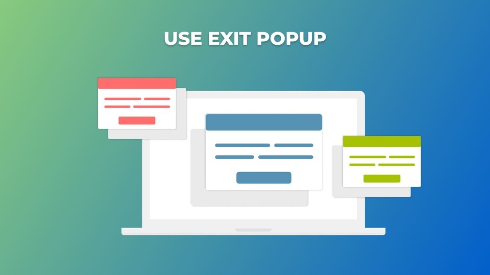
Exit popups are another way to improve the usability of your checkout page.
The exit popup feature provides a comprehensive view because it tracks the user’s mouse movement and displays your store’s offers as soon as the user plans to exit.
You can even enable the exit popup for more than one page, not just the checkout page. You can also pique your users’ interest by asking them various questions, providing a coupon, asking them to sign up to receive a coupon, and so on.
Extra tips and tricks: You can even offer your users additional discounts if they sign up for an account, which is another way to optimize your checkout page and connect with them for future marketing.
Conclusion
Improve your page speed by simplifying the user experience. This will allow you to optimize checkout for your target audience, which will eventually lead to increased customer satisfaction and trust.
Are you ready to optimize the design of your checkout page? Please leave a comment and let us know how your results turned out. Please tell us about your website’s checkout page. We would be delighted to hear from you.
If you enjoyed this article, please take a moment to share it and follow us on social media to stay up to date.
Subscribe to our YouTube channel for videos related to WordPress plugins and themes. Follow us on Facebook and Twitter for updates related to WordPress.
You may also like:
Top 7 Email Customizer Plugins for Woocommerce You Can’t-Miss


